It does look better than the roundel. I'll just add the original color hues and I think it's the best it can be:

You are using an out of date browser. It may not display this or other websites correctly.
You should upgrade or use an alternative browser.
You should upgrade or use an alternative browser.
Request Maps/Flags/Coats of Arms/Heraldry here, II
- Thread starter Pragmatic Progressive
- Start date
The colours I used are from the American flag, since Arcasia is a knockoff of the US. These aren't that different though.
Do you not like the compass rose? I think for Arcasia it is a great piece of symbolism for their superpower status, with their power projecting across all cardinal directions.
I am pretty sure the Suzerain devs based it off of NATO, and given that Arcasia is basically the leader of alternate NATO it makes sense.
This version does seem similar enough to the original though, and it does look much better, cleaner, more beautiful and well-developed.
There's real-world reasons I chose to have it in the quadrant btw, it's so that in real world use, the top side and bottom side can be differentiated.
For example when flags are flown upside down as a distress signal, without the quadrant compass rose the flag looks exactly the same turned upside down.
Last edited:
Simplest way I can think of is to with OTL New Amsterdam (ex: southern part of OTL Manhattan) and then extending from there in a different direction than OTL NYC (ex: the rest of OTL Manhattan then up the peninsula to include OTL Queens, Yonkers, MT Vernon, Pelham & Pelham Manor.)
Smaller towns OTL could have a larger density to allow you to end up with, say, 4 million people or else for the same density, have smaller sky scrappers but have them present further outside of Manhattan.
M. Pasquin, thank you most kindly for answering this question and please pardon my taking so long to reply: that was quite ill-mannered of me.
One of my ideas for New Amsterdam (To help visibly set her apart from New York City) was that there could have been a gentleman's agreement of the sort that kept Skyscrapers from dominating the Philadelphia skyline for quite some time - I've also toyed with smuggling in some elements from the original Amsterdam, but am not quite sure how to make that work with a Northeastern US setting.
It does look better than the roundel. I'll just add the original color hues and I think it's the best it can be:
View attachment 901741
Incidentally, that is one absolutely gorgeous Science Fiction flag: it looks like the Union Jack/Old Glory love child one never knew I always wanted!
The colours I used are from the American flag, since Arcasia is a knockoff of the US. These aren't that different though.
Do you not like the compass rose? I think for Arcasia it is a great piece of symbolism for their superpower status, with their power projecting across all cardinal directions.
I am pretty sure the Suzerain devs based it off of NATO, and given that Arcasia is basically the leader of alternate NATO it makes sense.
This version does seem similar enough to the original though, and it does look much better, cleaner, more beautiful and well-developed.
There's real-world reasons I chose to have it in the quadrant btw, it's so that in real world use, the top side and bottom side can be differentiated.
For example when flags are flown upside down as a distress signal, without the quadrant compass rose the flag looks exactly the same turned upside down.
Perhaps you could take a leaf out of the Union Flag's playbook and offset those fimbriations, in order to make it more evident when the flag is flying upside down?
just get rid of the Hudson and east riversM. Pasquin, thank you most kindly for answering this question and please pardon my taking so long to reply: that was quite ill-mannered of me.
One of my ideas for New Amsterdam (To help visibly set her apart from New York City) was that there could have been a gentleman's agreement of the sort that kept Skyscrapers from dominating the Philadelphia skyline for quite some time - I've also toyed with smuggling in some elements from the original Amsterdam, but am not quite sure how to make that work with a Northeastern US setting.
Maybe it is different with a physical flag, but the Union Jack looks the same both ways?Perhaps you could take a leaf out of the Union Flag's playbook and offset those fimbriations, in order to make it more evident when the flag is flying upside down?

Maybe it is different with a physical flag, but the Union Jack looks the same both ways?
In my defence, tipping poor flags as though they were mere cows has never been my pastime!
On a more serious note, why not depict that Suzerian flag with a nautical variant? (So that those in distress at sea can fly it upside down; presumably this flag would be the equivalent of the Red, Blue and White Ensigns).
Maybe it is different with a physical flag, but the Union Jack looks the same both ways?
With the Union Jack the corners are slightly different so if one really tries it can be noticed.
But I agree that to an untrained eye it doesn't look any different upside down.
(Also, vertical tricolours like France also would be the same upside down. And for some horizontal tricolours being upside down would make it the flag of another country.)
I'd like a Socialist/Syndicalist version of the Michigan State Seal
If you were to rotate the tricolore then it would be different, instead of flipping it horizontally.With the Union Jack the corners are slightly different so if one really tries it can be noticed.
But I agree that to an untrained eye it doesn't look any different upside down.
(Also, vertical tricolours like France also would be the same upside down. And for some horizontal tricolours being upside down would make it the flag of another country.)
To make the Union Jack look different, you can't just rotate it 180 degrees like I was doing, you also need to flip it all the way to the other side.
Do you have any other ideas for Suzerain flags which should be redone?It does look better than the roundel. I'll just add the original color hues and I think it's the best it can be:
View attachment 901741
Sure. Let's try Morella. Their flag is nice and distinctive, but the black outlines around the stars look unprofessional.Do you have any other ideas for Suzerain flags which should be redone?
Republic of Morella - Suzerain Universe Codex
Discover the unique history and current political landscape of Morella, a presidential republic in South Merkopa. From its independence to its current leadership by the Morellan Unified Front, explore the country's past empires and development into a repu
 codex.torporgames.com
I was thinking the same thing actually, playing this game I could only think how well done it all is except for the flags, but maybe I am just a vexillology autist. 😂Sure. Let's try Morella. Their flag is nice and distinctive, but the black outlines around the stars look unprofessional.
View attachment 902369
Republic of Morella - Suzerain Universe Codex
Discover the unique history and current political landscape of Morella, a presidential republic in South Merkopa. From its independence to its current leadership by the Morellan Unified Front, explore the country's past empires and development into a repu
I will see what I can do with this, the design for this was particularly bad in my opinion.
Sure. Let's try Morella. Their flag is nice and distinctive, but the black outlines around the stars look unprofessional.
View attachment 902369
Republic of Morella - Suzerain Universe Codex
Discover the unique history and current political landscape of Morella, a presidential republic in South Merkopa. From its independence to its current leadership by the Morellan Unified Front, explore the country's past empires and development into a repu
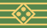
Republic of Morella redesign, kept all the elements and geometric sensibility as close to the original as possible whilst making it adhere to vexillological conventions and general geometric rules for design.
The stars are too small on that one, I think.Republic of Morella redesign, kept all the elements and geometric sensibility as close to the original as possible whilst making it adhere to vexillological conventions and general geometric rules for design.
View attachment 902640
I tried two designs, one in which the stars are as tall as the green stripes, so they are bigger, more visible, fit in well enough, and the design is simple and close to the original.The stars are too small on that one, I think.
In this other one I used a diamond in the middle to make it so that the stars are not in contact with any stripes, but it is a large departure from the original design so I do not like it.
I had tried one with has differently shaped stars like the original, but no matter what it did not look good, it throws off the flag design conventions of meaningful proportions and design ratios, and looks ugly.
I think that is the biggest mistake in the original flag design along with the bad looking outline on the stars, so I will especially try to avoid that.
Tell me what you think,
edit:
I fixed the corner so that the stripes don't have an awkward corner breaking them apart.
Attachments
Last edited:
^^ Is it just me or does anyone else get a strong ‘Not Australian but we will absolutely be stealing their Look’ vibe from those stars and that colour scheme? ^^Sure. Let's try Morella. Their flag is nice and distinctive, but the black outlines around the stars look unprofessional.
View attachment 902369
Republic of Morella - Suzerain Universe Codex
Discover the unique history and current political landscape of Morella, a presidential republic in South Merkopa. From its independence to its current leadership by the Morellan Unified Front, explore the country's past empires and development into a repu
Share: